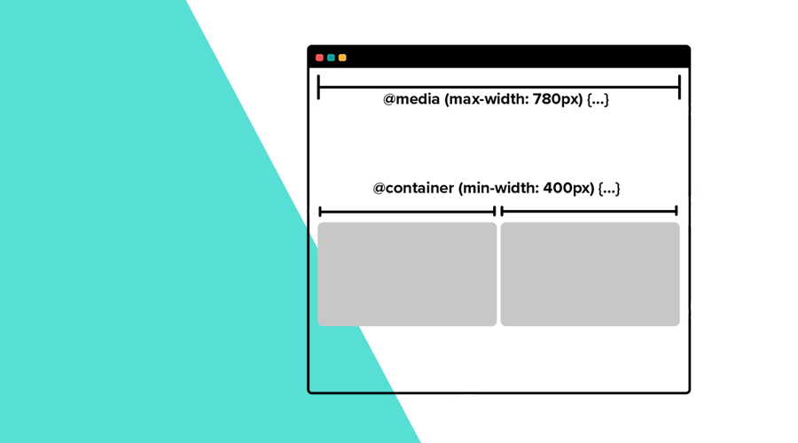
In this week's post, I would like to demonstrate how container queries can help you take responsive design to a new whole new level. As of this year, container queries are supported in all major browsers, making it a viable solution for a problem that has been plaguing web developers for years.
Unlike media queries, container queries allow you to apply styles to elements based on the size of their parent element, instead of the size of the viewport.
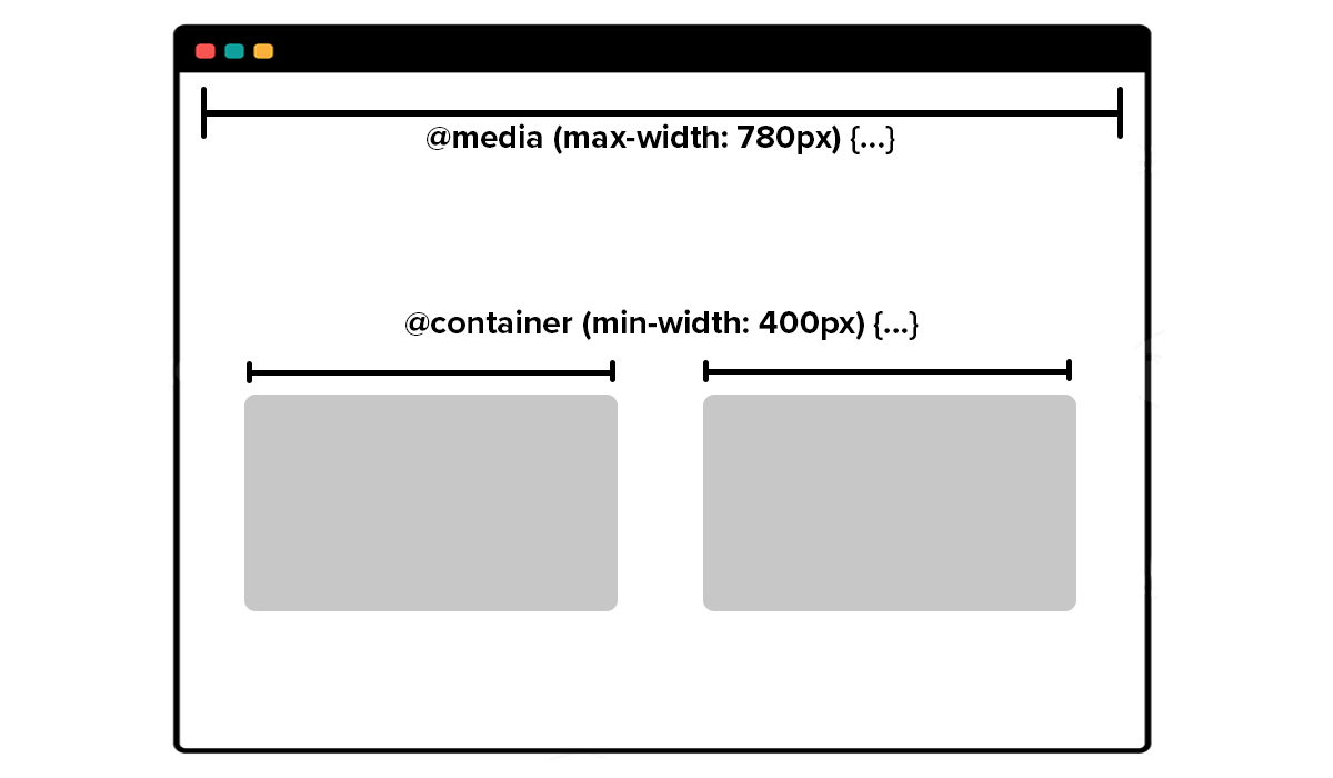
This makes container queries perfect when you want to build more robust and flexible layouts.
The problem
Although media queries enable us to build web interfaces that adjusts to the size of the screen, you will easily face their shortcomings whenever your UI components need to adjust to the context they are in. Let's take a look at the following example:
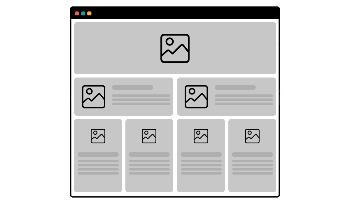
In this example, you can see that we have different variations of a card. Using only media queries, you would have to create a different component for each variation. So far so good, although you need to create a component for each card style, you can make it responsive for different screen sizes.
But, if for some reason, you want to fit another piece of content in your design, that will make you rethink your cards' styles:
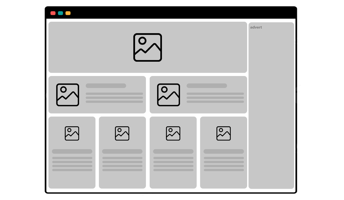
With media queries you simply cannot do this, and it will force you to change all your variations, quickly making your components' CSS styles more complex and difficult to maintain.
The solution
What if you could query the size of the parent element (container) where your card is located? Container queries enable us to inquire about the dimensions of an element, rather than those of the viewport, and adjust the styling of its descendants accordingly. They are similar to media queries, but they offer increased flexibility in managing layouts, potentially leading to significant code simplification.
With container queries you can now create one single component that takes different forms depending on their location in a page:
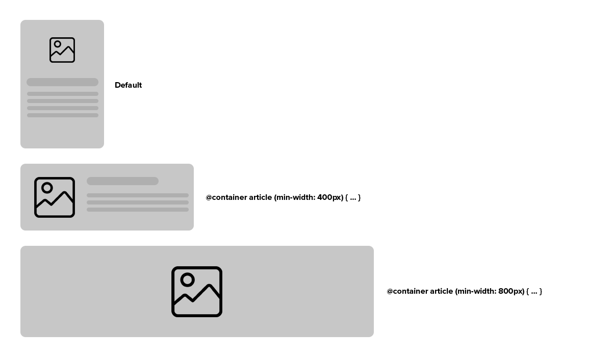
Let's consider the following markup for the component:
<div class="article">
  <div class="card">
    <img class="card-img" src="..." alt="" />
    <div class="card-content">
        <h2 class="card-title">...</h2>
        <p class="card-text">...</p>
    </div>
  </div>
</div>
You can assign a containment context using the following styles:
.article {
  container-type: inline-size;
  container-name: article;
}
Or its shorthand declaration:
.article {
  container: article / inline-size;
}
Now let's consider the styles for the default variation of the component:
.card {
  display: flex;
  flex-direction: column;
  flex-wrap: wrap;
  gap: 1rem;
}

.card-img {
  aspect-ratio: 1 / 1;
  flex: 0 0 150px;
  border-radius: 7px;
}

.card-title {
  font-weight: bold;
  font-size: 1.5rem;
  margin-bottom: 0.5rem;
}

.card-content {
  flex: 1;
}
With container queries, you can now style a variation of the component when positioned in area wider than 400px:
@container article (min-width: 400px) {
  .card {
    flex-direction: row;
  }

  .card-img {
    flex: 0 0 100px;
    align-self: flex-start;
  }
}
And because our component should become a hero styled element when located in a larger area, we would also add the following styles:
@container article (min-width: 800px) {
  .card {
    position: relative;
    justify-content: center;
    align-items: center;
    min-height: 350px;
  }

  .card-img {
    position: absolute;
    left: 0;
    top: 0;
    width: 100%;
    height: 100%;
    opacity: 0.25;
  }

  .card-content {
    position: relative;
    flex: unset;
  }

  .card-title {
    font-weight: bold;
    font-size: 1.5rem;
    margin-bottom: 0.5rem;
  }

  .card-text {
    max-width: 480px;
    margin-left: auto;
    margin-right: auto;
    text-align: center;
    color: #222;
  }
}
Container query length units
When styling a container with container queries, you have the option to utilize container query length units too. These units define a length relative to the dimensions of the specified query container. Utilizing length units tied to the container's dimensions makes components more adaptable, eliminating the need to recompute specific length values when used in diverse containers.
For example, the following styles would use the cqi unit to set the font size of our card's title accordingly:
@container article (min-width: 800px) {
  .card-title {
    font-size: max(1.5em, 1.23em + 2cqi);
  }
}
For more information about these units, please read this guide.
Conclusion
Of course, media queries are still the way to go if we want to adjust a parent container to the size of the viewport, but they fall short when you want to let your components adjust to the context they are in. Container queries are the future of responsive web development and with the adoption from all major browsers, there's nothing stopping you from changing the way you create web components.
As always, you can find us available for any question you might have via our Support Channel.


